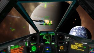
Bungie’s Marathon immediately slaps you in the face with a barrage of colours, shapes, and sounds. Booting up the game during the ongoing server slam just before the game’s real release date is like being flash-banged with creativity, aggressively water-boarded by a sense of style that AAA games simply don’t have anymore.
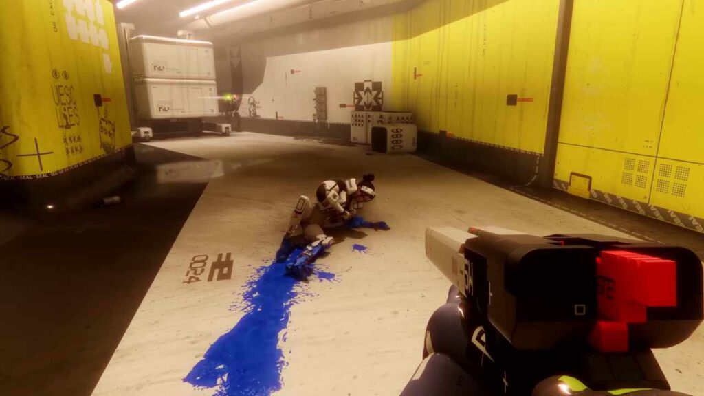
In my time with Marathon, I’m impressed. It is, by far, the most casual extraction shooter around, even more so than Embark Studio’s mega-hit Arc Raiders. It’s not hard to find a gun, it’s not that hard to find ammo. In fact, it’s harder to find human players than it is to find the necessities, and that’s quite refreshing in a genre that’s usually focused on making sure you suffer at least every few matches.
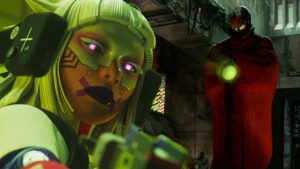
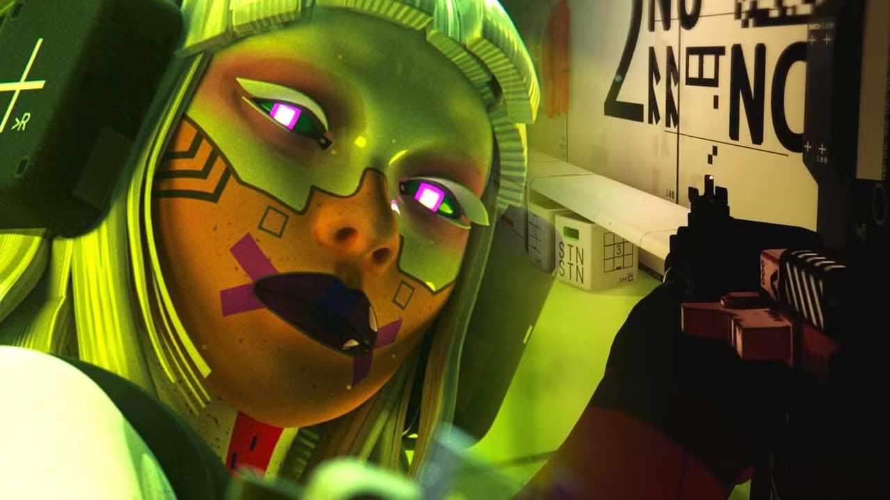
The main conversation around Marathon since launch hasn’t really been the gameplay, but instead the look of the shooter. Since it’s reveal, Bungie’s game has been pitched almost solely on its style, and it’s very excited to Clockwork Orange you right off the back to make sure you take in every detail of its art package.
Sights and sounds are everything to Marathon, it’s a Jimmy Neutron brain blast of style, and it’s so god-damn refreshing. In an age where UIs have been stomped down to be as minimalist as possible, there’s simply no personality to menus any more. Everything has to be sanitised and ordered to make sure you’re playing exactly the same way as everyone else.
Bungie’s menu work was always fantastic. Halo: Combat Evolved took the style of the Y2K era and kicked it into overload when it launches in 2001. Halo: Campaign Evolved, a full remake which launches this year, has no such style in its menus and UI, and that’s a damn shame. Instead of the menus looking like Halo, they just look like a menu.
As with any game now, there’s a slew of complaints running around social media, mostly the crap one owned by abysmal gamer Elon Musk, whining about the overabundance of UI in Marathon. It’s a UI that has to be learned, and you’re not going to learn it in one evening. But with some dubbing the UI “fontslop” because it dares to have a little bit of style, I can’t help but groan at the reaction.
There are a lot of layers to Marathon’s UI, but is it really that complicated? In my time with the game so far, the only confusing element of the UI has been equipping skins on guns. Compared to any extraction shooter, even Arc Raiders, I’m spending less time in menus than ever before with the game just raring to get me back in another match.
The truth is that Marathon looks bloody sublime. It’s dripping in style and it wants to show it, and so much of that is in the way its UI kicks you into a retro-future. I feel like I’m in a modern System Shock, it’s a game that actually feels sci-fi-punk. It’s cool. Yes, some refinements probably do have to be made but, honestly, a little bit of clunk for a whole lot of style.
I still need more time with Marathon to figure out how good Bungie’s new shooter is, but I’m completely sold on its aesthetic. Even if the game fizzles out with a whimper, I hope Bungie’s bold FPS makes other studios take notice because style and substance go hand-in-hand, and we certainly need more style in AAA games these days.